Well, so someone's got to give you a critique. Unfortunately you're stuck with me here...
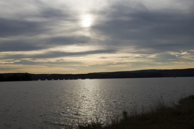
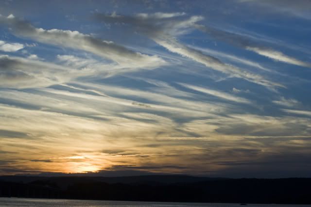
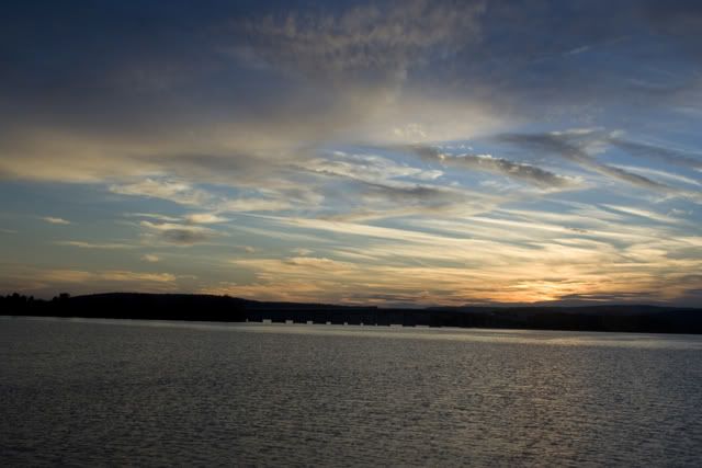
Well I don't doubt the sunset/rise didn't look beautiful at the horizon, they just weren't working for me. This includes numbers: 1,3,4,5,6,7,8. The subjects at the horizon line (buildings/land) are just too far away and dark as subjects. Also, the sky in general isn't too particular interesting. Though I do not doubt it was beautiful looking.
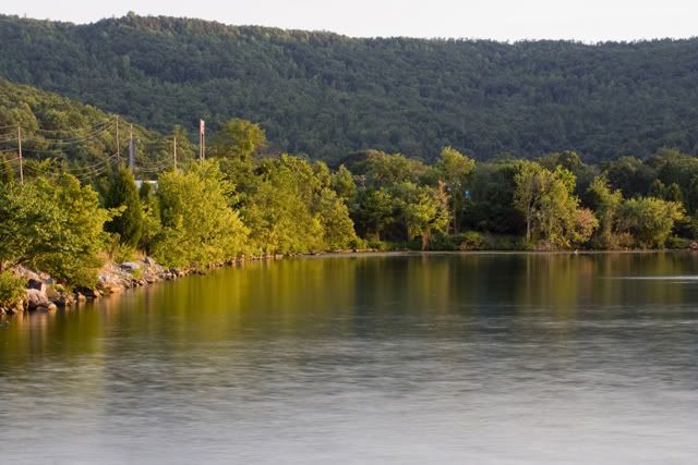
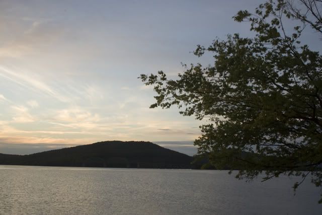
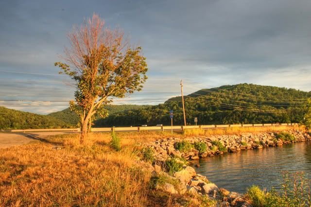
I enjoy number 2. That's because of the corner of the lake/pond where the land bends and how you framed the shot.
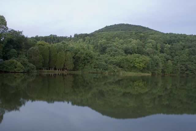
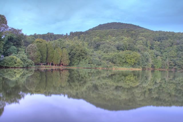
Number 9, good times. Nice reflection. Nice rule of 1/3's. Nice interesting variation of trees.
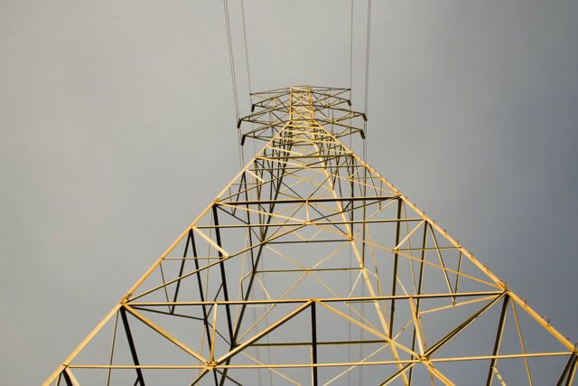
Number 10, I split on this one. I like the shot. I like the color of the tower, the angles and the perspective. But that tower just isn't interesting to me. I don't know about other area's, but I've seen many of those style and they just don't do anything for me. Though not to take away from the shot you took of it...you really can't compose that shot too much better.
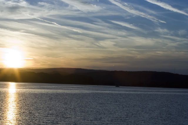
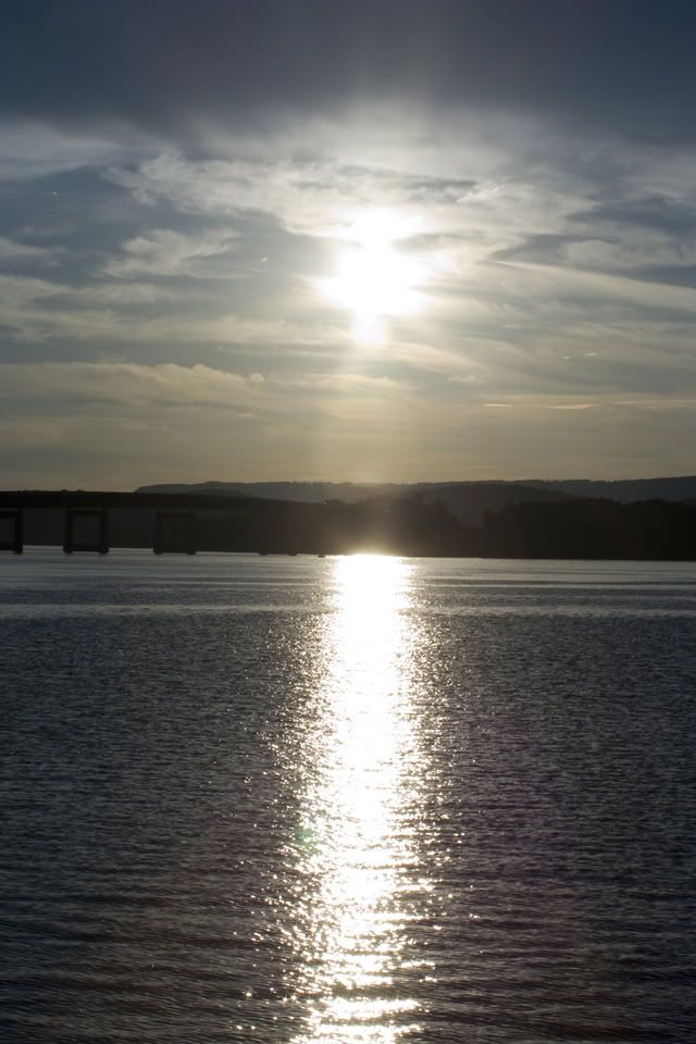
Number 11 is there your horizon line shots are getting more interesting. The subject is larger and I'm able to see more of it (but still want to see more) and the sun in the sky and it's reflection are interesting and I don't have to worry about getting eye cancer because you took that bullet for me by taking the picture.
Number 12, the sky is slowing getting more interesting. C'mon mother nature...
Number 13, interesting to look at. Again I like how you framed the shot, like the bend/corner of the lake. Mountains in background = a plus. I like the fullness of the saturation...kind of. I like how it's full of color, but I don't like how it's the sun almost going down kind of color and wish it was the sun is a few hours from now going kind of color is that makes any sense at all.
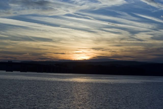
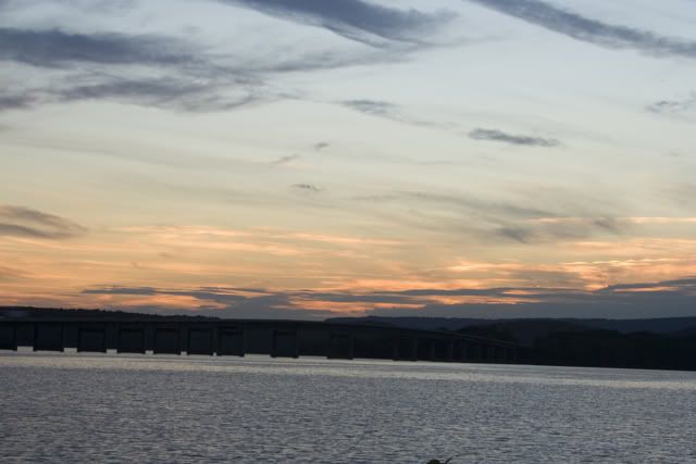
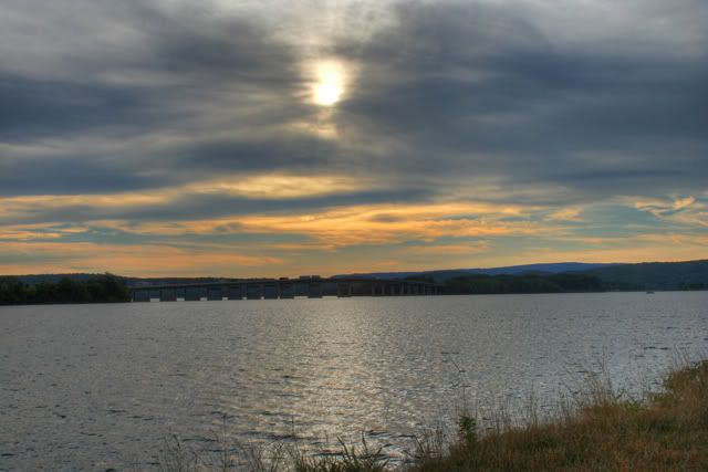
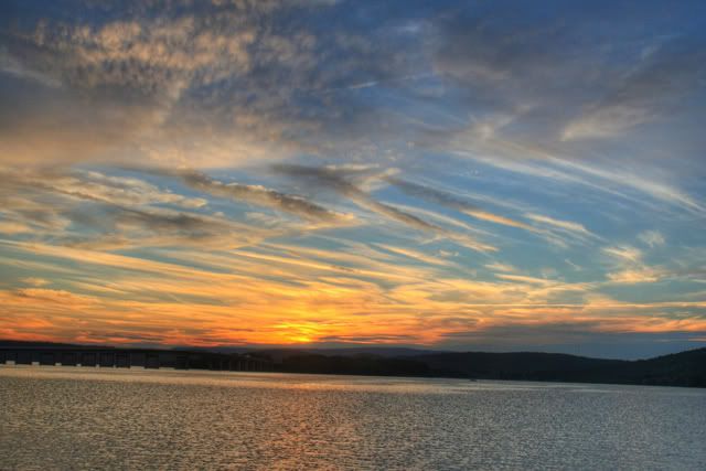
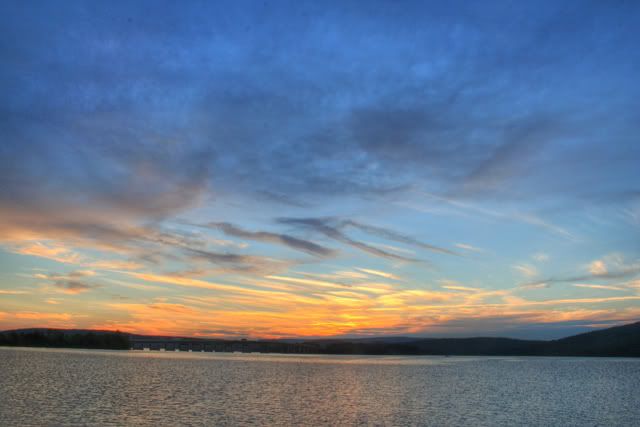
Numbers 14 vs. 15: These two are the best of your horizon shots. I like. 14 wins because the bridge is closer and the sky is more interesting.
Number 16...haven't I seen this somewhere before? Oh yah right in this thread! I actually like this one A LOT more better than the other one. Much nice colors in this one.
Well I hope this all helps. There was a lot of goodness overall. Don't worry though, any of the negative part of this critique that I gave you I also do myself.
|

 order your copy of Access All Areas today!