forums
new posts
donate
UER Store
events
location db
db map
search
members
faq
terms of service
privacy policy
register
login


UER Forum > Private Boards Index > Non-UE Photo Critique > portrait critique (Viewed 2384 times)
aurelie 


Location: pacific northwest
Gender: Female
Total Likes: 48 likes


high tech:: low life.

 |  |  | website
portrait critique
< on 9/16/2009 5:23 PM >
Reply with Quote
Posted on Forum: UER Forum
sometimes, aurelie tries her hand at fashion photography.
i'm not at all sure how i feel about this one.
thoughts?


reckless thoughts abide; anachronistic and impulsive.

loosely jacketed against the cold and ten thousand worlds for the choosing.
metawaffle 

King of Puns


Location: Brisbane!
Gender: Male
Total Likes: 19 likes


Purveyor of Fine Lampshades

 |  |  | longexposure.net
Re: portrait critique
< Reply # 1 on 9/16/2009 5:27 PM >
Reply with Quote
Posted on Forum: UER Forum
Vague thought: Perhaps the lipstick could be a little richer and more prominent?


http://www.longexposure.net
bouncewiggle 


Location: Johnson City, TN
Gender: Female
Total Likes: 20 likes


 |  |  | AIM Message | HijackedMind's MySpace
Re: portrait critique
< Reply # 2 on 9/16/2009 6:30 PM >
Reply with Quote
Posted on Forum: UER Forum
The upper lip could be better defined somehow (I guess play with it in Photoshop). Her cheek is a bit washed out. If you're going for the washed out look, I'd try to make the rest of her skin match that a little more. I feel like there's something a little strange about the angle of the shot but can't really figure out what. Also, were you to do it again, I'd suggest having her hair less neat and tidy, and more flowy/messy.


"bouncewiggle, now more entertaining than Jell-O"
argonian 


Location: Toronto, ON
Gender: Female
Total Likes: 6 likes


"Now with added cats!"

 |  | 
Re: portrait critique
< Reply # 3 on 9/16/2009 6:37 PM >
Reply with Quote
Posted on Forum: UER Forum
Her left shoulder looks bruised and beaten. I might also try different crops, like just cutting that part of her body out and making the focus her face and hair.


Que pasa, baby?
profoundunderground 


Location: the shit abyss
Gender: Male
Total Likes: 0 likes


 |  | 
Re: portrait critique
< Reply # 4 on 9/18/2009 6:59 PM >
Reply with Quote
Posted on Forum: UER Forum
The light is a little harsh, I find myself really distracted by the shadow near the neck and from the sunglasses. I would also suggest playing around with the angel a bit more, I'm not trying to say its awkward or anything, but I do think you could get a more flattering angle. Maybe try it with her hair down?


shellyl 


Location: Lenoir NC
Gender: Female
Total Likes: 10 likes


I have learned not sweat the petty things and not to pet the sweaty things.

 |  | 
Re: portrait critique
< Reply # 5 on 9/18/2009 7:22 PM >
Reply with Quote
Posted on Forum: UER Forum
Posted by argonian
Her left shoulder looks bruised and beaten. I might also try different crops, like just cutting that part of her body out and making the focus her face and hair.


I have to agree with argonian here. Her shoulder is the first thing that caught my attention and pretty much kept it.


A mirage is not an optical illusion. It is a real phenomenon, and one can take photographs of it. The interpretation of the image, however, is up to the fantasy of the human mind.

argonian 


Location: Toronto, ON
Gender: Female
Total Likes: 6 likes


"Now with added cats!"

 |  | 
Re: portrait critique
< Reply # 6 on 9/18/2009 7:35 PM >
Reply with Quote
Posted on Forum: UER Forum
Except that I don't know my left from right.

I tried cropping it and couldn't come up with a good crop, but it did make me realize that the shadow under her left shoulder is too harsh for my liking. I didn't really notice it before


Que pasa, baby?
Colorblinded 


Location: Rochester, NY
Gender: Male
Total Likes: 2 likes


Armed with cameras.

 |  |  | AIM Message | The Colorblind Photographer
Re: portrait critique
< Reply # 7 on 9/23/2009 3:29 PM >
Reply with Quote
Posted on Forum: UER Forum
I agree the shoulder catches the eye and is distracting. The lighting looks like harsh direct sunlight and is creating some hot spots while other areas are more nicely lit, like the right side and top of her face.

With something like this I would definitely use something to block the direct sunlight so that the lighting is softer and more flattering.

The angle and sunglasses don't really add anything for me either, but the biggest issue is just the lighting. If I am forced to shoot people outdoors (I don't generally care to) the best (and easiest) lighting is usually on overcast days or in the shade.


The Colorblind Photographer
A. Lien 


Location: Fantasy Island B.C.
Gender: Male
Total Likes: 17 likes


Abductees Anonymous all welcome

 |  | 
Re: portrait critique
< Reply # 8 on 1/12/2010 10:55 PM >
Reply with Quote
Posted on Forum: UER Forum
Posted by profoundunderground
I would also suggest playing around with the angel a bit more,


Agreed, play more with the angel 
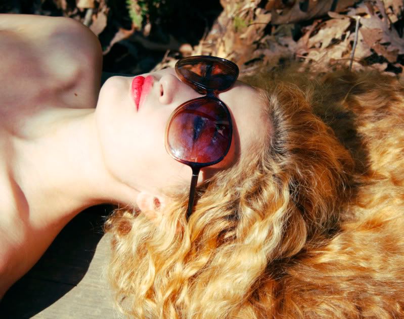
Srysly though, there's a disturbing feel and tension in the photo, in a good way. She doesn't look too comfortable, yet not in pain, the bruising color suggests foul play, the images in the glasses add to the mystery, and look awkward when viewed from the angle you've posted.

It's worth shooting a minimum of ten shots of a situation like this, even ten of the crop you have chosen. And some full or more body, different POV. Maybe stand over her if you want the dominating look. The semi out of focus bg adds to the tension here. Normally I would suggest either more out of focus, or sharp, but here your breaking the 'rules' works. Bounce cards will give you more light control.

This photo inspires questions, seems like a film still. Definitely some Laura Palmer Twin Peaks vibe happening. Would be fun to see more, nice work.


My sister is Charlotte Light and Dark. Who am I?

Farewell and thank you... "I was doing something that I thought could have some impact someday. In many ways, it's really these photographs that kept me going creatively." Dennis Hopper
UER Forum > Private Boards Index > Non-UE Photo Critique > portrait critique (Viewed 2384 times)


Add a poll to this thread


This thread is in a public category, and can't be made private.


All content and images copyright © 2002-2024 UER.CA and respective creators. Graphical Design by Crossfire.
To contact webmaster, or click to email with problems or other questions about this site: UER CONTACT
View Terms of Service | View Privacy Policy | Server colocation provided by Beanfield
This page was generated for you in 125 milliseconds. Since June 23, 2002, a total of 738455097 pages have been generated.